Last updated: November 05, 2026
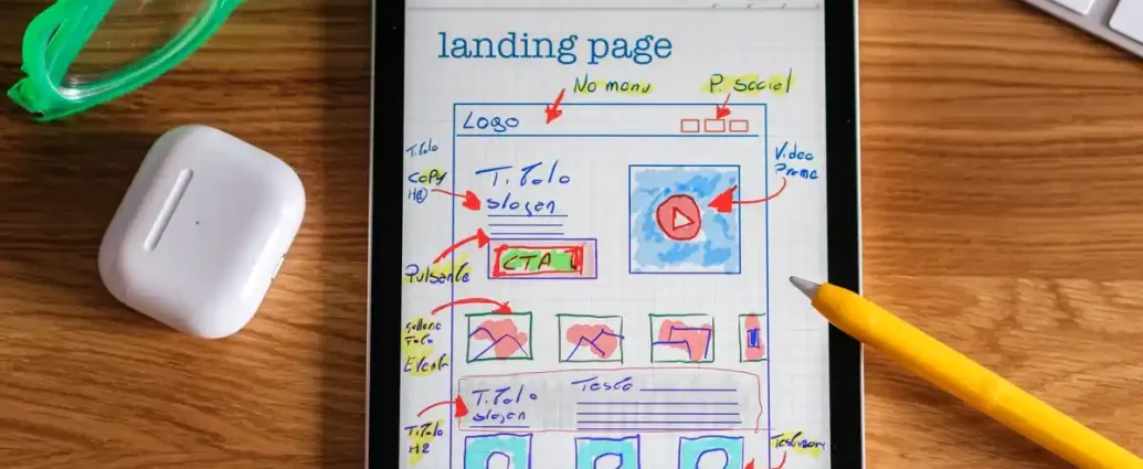
Quick Answer: A strong service page structure usually uses 6 core sections: opening, problem framing, benefits, proof, process, and CTA. Service page copy structure is the order and content that turn a service page into a clear sales page instead of a vague brochure. If the page is meant to generate leads, the structure has to answer three things fast: what the service is, why it matters, and what the visitor should do next.
What service page copy structure has to do
Service page copy structure has to move a reader from curiosity to action without making them work for the answer. A good service page usually has one job: get the right visitor to send an inquiry, book a call, or request a quote. That means the page cannot read like a homepage, an about page, or a brand manifesto.
The structure has to do four things in order. First, it names the service in plain language. Second, it frames the problem the service solves. Third, it proves the service can deliver the result. Fourth, it gives the reader a clear next step. If any one of those is missing, the page usually leaks attention.
This is where many pages go wrong. They start with a vague statement like “solutions tailored to your needs,” then drift into company history, then bury the contact form at the bottom. That kind of copy may feel polished, but it forces the visitor to decode the offer. Service page copy works best when the reader can understand it in under 10 seconds.
The goal is not to sound bigger. The goal is to make the offer easier to buy.
That is one reason the strongest service page copy structure is usually practical rather than decorative. It respects the way people scan: headline, benefit, proof, process, FAQ, action. It also supports lead generation because it gives the visitor enough confidence to take the next step without reading every line. A page that does that well can support the hub page on branding and website content without trying to replace it.
How do I structure a service page?

Structure a service page in the same sequence a cautious buyer uses: identify the service, explain the problem, show the payoff, explain the process, prove credibility, and close with a clear action. That sequence works because it matches the questions people ask themselves before they inquire.
Here is a practical order that fits most service pages:
-
Lead with a specific headline and subheadline.
Put the service name in the headline and the main outcome in the line below it. A visitor should know within 5 seconds what is being sold and who it is for. If the headline says only “Expert Support,” the page forces interpretation. If it says “Website Copywriting for Service Businesses,” it does not. -
Add a short problem framing section.
Name the pain point in the reader’s language. One paragraph is often enough. The point is to show that the page understands the cost of the problem: missed leads, unclear positioning, low trust, or a slow sales process. -
Follow with benefits, not just features.
Translate the service into outcomes. A feature might be “3-page website copy.” A benefit is “gives prospects enough clarity to inquire without a sales call.” Benefits make the page feel useful, not technical. -
Explain the process in 3 to 5 steps.
People want to know what happens after they inquire. A short process section lowers friction because it makes the work feel predictable. Use concrete stages such as discovery, draft, review, and final delivery. -
Show proof elements.
Use testimonials, case study snippets, recognizable tools, certifications, or sample deliverables if they are relevant. Proof is not decoration; it answers the reader’s silent question: “Why trust this provider?” -
End with a focused call to action.
Ask for one thing. “Book a consult,” “Request a quote,” or “Send a project brief” works better than three different options. Too many choices can reduce response.
This sequence is not a template to copy blindly. A page for a local plumber, a law practice, and a B2B consultant may each need different proof and different language. But the order still holds because the buyer’s questions stay the same.
The opening section that earns the next 30 seconds
The opening section should tell the reader what the service is, who it is for, and what result it creates in no more than 2 short blocks. That opening is not a slogan space; it is the page’s sorting mechanism.
A strong opening usually includes three parts. The headline names the service. The subheadline states the main outcome. The first paragraph frames the real-world problem. For example, a service page for copywriting should not open with “Words that work.” It should say something closer to “Service page copy that helps visitors understand the offer and inquire faster.” That is a sentence a buyer could use.
The opening also has to earn attention from the right reader and repel the wrong one. If the service is only for enterprise clients, the opener should signal that. If the service is for startups with a small budget, say so indirectly through the wording and scope. That saves time for both sides.
One useful rule: if the opening could fit almost any service, it is too generic. The reader needs at least one concrete marker — industry, audience, outcome, or deliverable. A page with “We help businesses grow” could be about almost anything. A page with “Service page copy for consultants who need more qualified inquiries” is easier to trust.
Do not overload the top with 4 different calls to action, a long list of services, and a company bio. Keep the top visible, immediate, and specific. On most service pages, the first screen should do one job only: confirm the visitor is in the right place.
Problem framing that makes the service feel necessary

Problem framing makes the service feel necessary by naming the cost of not solving the issue. A service page that skips this section usually reads like a product sheet. It may describe what is sold, but it does not explain why the reader should care now.
The best problem framing is usually narrow. It should describe 1 main pain point, not 6. For service page copy, that pain is often one of these: the offer is unclear, the visitor does not know what happens next, the page looks professional but does not convert, or the service sounds similar to every competitor.
This section works best when it uses the reader’s situation rather than the provider’s vocabulary. “We create compelling messaging” sounds internal. “Your page explains the service, but it does not answer the buyer’s next question” sounds lived-in and specific. The second version shows the gap in plain terms.
A useful pattern is:
- state the problem,
- show what it costs,
- hint at the fix.
For example: “When a service page buries the offer under general claims, visitors leave before they understand what is being sold. That costs inquiries, because people will not request a service they cannot picture.” That structure is useful because it connects the copy problem to a business outcome.
This section should stay tight. 2 or 3 short paragraphs are usually enough. If it turns into a manifesto, the page starts to feel preachy. The reader does not need a lecture about marketing. The reader needs to feel seen, then moved on to the solution.
The honest limitation here is simple: problem framing will not rescue a weak offer. If the service itself is vague or uncompetitive, copy cannot manufacture demand. It can only make the offer easier to evaluate. That is still valuable, but it is not magic.
Benefits and proof that make the offer believable
Benefits and proof make the offer believable by showing what the visitor gains and why that result is credible. A service page needs both because benefits create desire, while proof reduces doubt. Leave out either one and the page feels incomplete.
Benefits should be written as outcomes the buyer can picture. Good service page copy avoids empty claims like “high-quality” unless the page explains what that means. Better examples are “fewer back-and-forth emails,” “a clearer sales conversation,” or “a page that helps qualified prospects self-select.” Those are practical gains, not buzzwords.
Proof should be chosen to match the service. A consultant may use testimonials and named credentials. A design firm may show before-and-after samples. A legal or regulated service may rely more on process clarity and qualifications than on dramatic claims. The point is not to pack in every proof type available. The point is to choose the 1 or 2 that answer the biggest objection.
A service page often needs proof elements such as:
- a testimonial from a relevant buyer,
- a short case study summary,
- a certification, standard, or professional membership,
- a portfolio sample,
- a note about process or scope.
Use proof near the claim it supports. If the page says the service improves clarity, place the testimonial or example close to that statement. Scattered proof reads weaker than proof anchored to a claim.
This is also where generic pages fail. They list benefits like “save time” and then add a testimonial that says nothing about the service. Or they add proof that sounds impressive but does not match the buyer’s concern. A five-star quote about “great communication” will not fully answer whether the service actually solves the problem.
One honest trade-off: proof can make a page feel heavier. That is the price of credibility. A page that tries to be airy and persuasive at the same time often ends up vague. Clear proof may take up more space, but it usually creates better leads.
The process section that removes friction
The process section removes friction by showing the visitor what happens after they contact the business. On a service page, this section often does more for conversion than another paragraph of praise because it replaces uncertainty with steps.
Keep the process to 3 to 5 stages. More than that can feel slow; fewer than that can feel unfinished. A simple structure might be: inquiry, discovery, proposal, delivery, follow-up. The exact names depend on the service, but the sequence should feel predictable.
This section should answer practical questions:
- How does the project start?
- What does the buyer need to provide?
- How long does each stage take?
- What is the approval or revision step?
- What happens after the work is done?
A service page for website copy might describe a short questionnaire, a discovery call, a draft review, and final edits. A service page for consulting might describe an initial assessment, a plan, implementation support, and review. The details matter because buyers want to know whether the service fits their schedule and appetite for collaboration.
The language here should be concrete. Replace “a collaborative process” with what collaboration means in practice. Does the buyer send a brief? Is there a 30-minute call? Is there one round of revisions or two? If the process is complicated, simplify the language. If the process is simple, do not make it sound ceremonial.
This section also helps pre-qualify leads. Visitors who do not like the process can leave early. That is a benefit, not a failure. A service page that brings in the right leads is more valuable than one that attracts everyone and frustrates half of them.
What to cut, what to keep, and what not to confuse with the service page
The service page should keep only the content that helps a visitor decide, and it should cut anything that belongs on a homepage, about page, or content strategy document. That discipline keeps the page focused enough to convert.
Common mistakes usually have a cost:
-
Putting the company story first.
Cost: the offer gets buried.
Do instead: use a short proof block or a brief “why this service exists” line after the main benefit. -
Listing features without outcomes.
Cost: the reader understands the service mechanically but not commercially.
Do instead: connect each feature to a result. -
Using one vague call to action for every stage of intent.
Cost: the page asks for a booking before trust is built.
Do instead: choose one primary action and, if needed, one low-friction backup such as “view examples.” -
Writing a long FAQ that repeats the body.
Cost: the page feels padded and harder to scan.
Do instead: use FAQs to handle real objections, pricing boundaries, timelines, or scope questions the body has not fully answered. -
Letting testimonials float without context.
Cost: the proof looks decorative.
Do instead: place testimonials next to the claim they support or introduce them with one sentence explaining why they matter.
This is also where a service page can easily drift into the wrong topic. Homepage copy has to introduce the whole business. About page copy has to build trust through identity and history. Brand messaging for small businesses has to define the larger voice and positioning. A service page does none of those jobs well if it tries to absorb them all.
One useful standard: if a paragraph does not help the visitor understand, believe, or act on the service, delete it or move it elsewhere. The cleanest service pages often look shorter than they were during drafting because they have removed everything that does not move the sale.
Why service page copy structure matters for lead generation
Service page copy structure matters for lead generation because it reduces the number of decisions a visitor has to make before contacting you. A page that is easy to scan, easy to trust, and easy to act on usually produces better inquiries than a page that tries to sound clever.
The structure supports lead generation in a direct way. The opening earns attention. The problem framing creates relevance. The benefits create desire. The proof creates confidence. The process reduces uncertainty. The CTA turns interest into action. That chain matters more than any single sentence.
It also helps you qualify leads before they arrive in the inbox. A clear service page discourages the wrong prospects and attracts the right ones. That saves time, which is one reason structured service copy is useful for small teams and solo providers who cannot afford long sales conversations with mismatched leads.
The trade-off is that a strong structure can feel less dramatic than a flashy page. That is fine. A service page is not a brand film. It is a decision page. If the reader understands the offer and knows what to do next, the copy has done its job.
For a broader framework around website messaging, the hub on branding and website content can sit above this page. This page’s job is narrower: make the service understandable enough that the right visitor chooses to act.
Key Takeaways
- A service page should answer what the service is,
Drafted with AI; not yet reviewed by a person.