Last updated: November 05, 2026
Key Takeaways
- Design and development services cover planning, visuals, coding, content setup, testing, and launch support.
- The right project begins with strategy that defines the audience, main tasks, and needed pages.
- Good web design should make hierarchy obvious within about 5 seconds, with clear headings, one dominant call to action, and breathing room.
- Development turns approved designs into a working site by coding, connecting the content system, and keeping it reliable across devices and browsers.
Web design and development services are the work that turns a business goal into a site people can use, trust, and buy from. In this guide to Web design and development services — The Complete Guide, the real question is not “What do these services include?” but “What should I buy, in what order, and how do I tell good work from a flashy mockup that will fail in production?”
If you are hiring for a new site, a redesign, or a rebuild, this guide to Web design and development services — The Complete Guide shows the parts that matter: strategy, design, content, development, testing, launch, and the ongoing work after launch. It also shows where projects go wrong, what should be in a proposal, and who these services are not a fit for.
What web design and development services actually cover
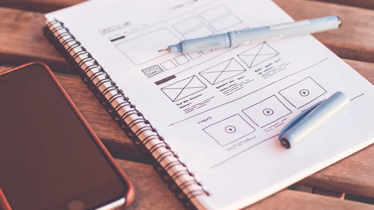
Web design and development services cover planning, visual design, front-end build, back-end logic, content setup, testing, and launch support. The simplest way to think about it is this: design decides how the site should look and behave; development makes it function in a browser and, when needed, in a content management system or application stack.
A useful scope statement should name the deliverables, not just the discipline. “Website design” is too vague. “Homepage, service page template, mobile navigation, contact form, CMS setup, and performance testing” tells you what is being bought. A project without that detail can drift for months.
Here is the core split:
| Area | What it produces | Common tools/standards | What to check |
|---|---|---|---|
| Strategy | Sitemap, user journeys, page priorities | Briefs, stakeholder interviews, analytics review | Does the site structure match business goals? |
| UX/UI design | Wireframes, visual comps, interaction states | Figma, design systems | Are states clear for hover, focus, error, and empty content? |
| Front-end development | HTML, CSS, JavaScript | Semantic markup, responsive layouts | Does it work on 360px to desktop widths? |
| Back-end development | Logic, data handling, CMS rules, APIs | WordPress, headless CMSs, frameworks | Are forms, logins, and content workflows reliable? |
| QA and launch | Bug fixes, checks, deployment | Cross-browser testing, accessibility checks | Does the site behave the same in Chrome, Safari, and Firefox? |
A provider that only sells “design” without asking about content, hosting, or maintenance is selling half a result. The opposite mistake is a development team that rushes into code before the page hierarchy is set. That often creates a site that works technically but feels confused to users.
The correct scope is visible on paper before any pixels are polished. The wrong scope is a mood board with no page list, no breakpoints, and no acceptance criteria. If the proposal does not mention mobile behavior, browser support, or how revisions are handled, the project is already under-specified.
How the right project starts: strategy before screens
The right project starts with a short strategy phase that defines the audience, the main jobs to be done, and the pages needed to support them. Without that, the design phase usually turns into decoration. With it, every later choice has a reason.
A good discovery phase is not a three-hour chat and a logo dump. It should produce a usable map. For a small brochure site, that may take 1 to 2 weeks. For a larger content site or an ecommerce build, it can take longer because the page inventory, content types, and integrations need more attention. For teams comparing options, this is also where web design services and web development services should be separated clearly so the scope stays realistic.
The steps that should happen first
- Define the primary business goal.
Check: Can the team say what counts as success in one sentence, such as leads, sales, bookings, or support reduction?
Do not: Start with colors, motion, or a homepage mockup before the goal is named. - List the target audience and their top tasks.
Check: Are the tasks concrete, like “book a consultation in under 3 minutes,” not vague, like “learn more”?
Do not: Treat every visitor as the same person; consult a qualified professional if the audience mix is unclear. - Inventory the existing content.
Check: Count pages, files, and assets; note what can be reused and what must be rewritten.
Do not: Assume old PDFs and blog posts can be dropped into a new site unchanged. - Map the site structure.
Check: The sitemap should show the first click and the second click for each major task.
Do not: Build a flat menu with 12 items because nobody wanted to decide what mattered. - Define technical constraints.
Check: Hosting, CMS, analytics, CRM, and form integrations are listed before design begins.
Do not: Discover on launch week that the email platform cannot receive the lead form data. - Set page-level acceptance criteria.
Check: Each template has a purpose, a content structure, and a mobile behavior rule.
Do not: Treat “looks good” as enough signoff unless the team has agreed on clear review criteria.
A strong strategy phase leaves visible traces. The homepage is not carrying every message. Service pages are not copies of each other. Contact paths are short. If the project is for an ecommerce site, product categories and filters are planned before visual design gets too far ahead.
A weak strategy phase shows up later as design churn. The team keeps moving sections around because no one agreed what the page is supposed to do. That can add weeks to a project. It also makes every stakeholder believe their priority is the homepage priority.
The honest trade-off here is time. Strategy feels slower than opening design software, but skipping it usually costs more in rework. This part is not for businesses that want a cosmetic refresh only, or for teams that already know the site is temporary and do not care about structure.
What good web design should look like on the page
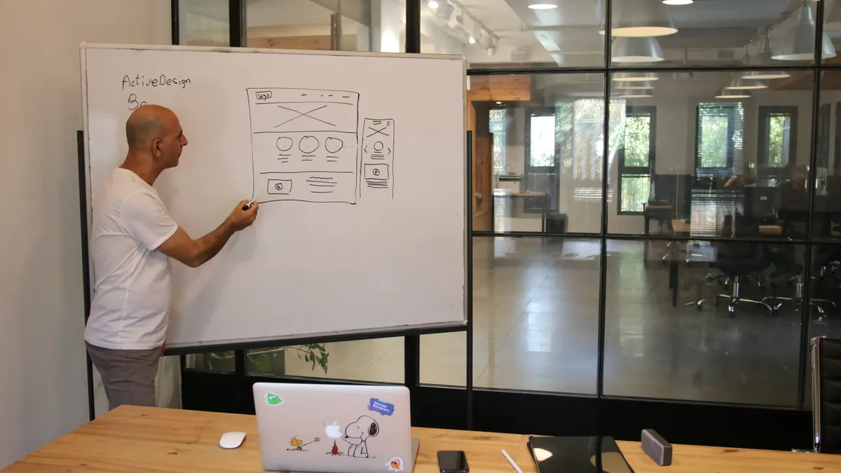
Good web design should make the page hierarchy obvious within about 5 seconds, with clear headings, one dominant call to action, and spacing that gives each section room to breathe. If a user has to hunt for the next step, the design is failing even if it looks polished.
The easiest way to judge design is to look at the page as a layout, not as art. The hero area should tell you what the site is about and what to do next. Below that, the page should move in a sequence: problem, proof, offer, details, action. That sequence can vary, but the user should never wonder where they are.
The details matter more than people expect:
- Headings should be specific, not poetic.
- Buttons should use action verbs.
- Body text should be large enough to scan comfortably on mobile.
- Contrast should remain readable in daylight and on lower-quality screens.
- Forms should not ask for more than they need.
A practical visual check is to zoom out to 25%. If the page still has a clear shape, it is probably organized well. If it turns into a pile of boxes, the hierarchy is weak. The key here is the visual weight of the headline and primary button — notice how one element leads the eye before the rest of the page opens up. That is what separates a guided page from a busy one.
| Element | Good pattern | Bad pattern | Why it matters |
|---|---|---|---|
| Hero section | One headline, one subhead, one primary CTA | Three headlines, two buttons, decorative copy | Users need a first action |
| Navigation | 5 to 7 main items | 10+ items plus hidden duplicates | Too many choices slow decisions |
| Spacing | Consistent gaps and margins | Uneven blocks pressed together | Crowding makes scanning harder |
| Typography | Two or three type styles | Five or more styles with no system | Inconsistency weakens trust |
| Forms | Short, clearly labeled fields | Long forms with vague labels | Friction lowers completion |
Design also needs to respect real screen sizes. A layout that looks elegant at 1440px can break at 375px if text wraps badly or a sticky header consumes half the viewport. The correct mobile result is not a shrunken desktop page. It is a reflowed page with readable text, tappable controls, and a stack that makes sense without pinching and zooming.
This section is not for projects where the only goal is visual branding and no one expects users to complete a task online; in that case, the work is closer to graphic design than web design, and the scope should say so plainly.
How web development services turn the design into a working site
Web development services turn approved designs into a functioning site by writing the code, wiring the content system, and making the site behave correctly across devices and browsers. This is the stage where visual intent becomes something a server and browser can actually execute.
A good build starts with structure, not effects. Semantic HTML gives the document a clear backbone. CSS handles layout, spacing, and responsiveness. JavaScript handles interaction only when the interaction needs it. Back-end work manages content, data, forms, and anything that has to persist beyond the page load.
The build process that avoids rework
- Set up the project structure.
Check: Are folders, naming conventions, and component boundaries defined before pages are built?
Do not: Scatter files without a pattern and hope the team remembers where everything lives. - Build the layout with semantic markup.
Check: Headings follow a logical order, and landmarks such as header, main, and footer are used correctly.
Do not: Use divs for everything when a meaningful element exists. - Create the responsive CSS.
Check: The layout adapts at common breakpoints such as 320px, 768px, and 1024px.
Do not: Lock widths to one desktop size and call it responsive. - Add interactive behavior only where needed.
Check: Menus, accordions, sliders, and forms work with mouse, touch, and keyboard.
Do not: Add motion that distracts from the task or breaks accessibility. - Connect the CMS or data source.
Check: Editors can update text, images, and page fields without touching code.
Do not: Hard-code editable content unless the site is intentionally static. - Test across browsers and devices.
Check: Chrome, Safari, Firefox, and mobile browsers display the page consistently enough for the project’s needs.
Do not: Assume one browser proves the site works everywhere.
The right codebase should stay boring in the best way. Pages load predictably, components reuse cleanly, and editors can make changes without breaking the layout. The wrong codebase often looks fine on day one and becomes fragile the moment someone changes a headline length or swaps an image aspect ratio.
For many business sites, WordPress remains a common CMS choice because editors can manage pages without a developer for every update. Headless setups, where content is separated from presentation, make sense when the site needs to publish to more than one front end or integrate deeply with other systems. That flexibility has a trade-off: more setup, more technical coordination, and a higher chance of needing specialist support. The WordPress.org documentation and the W3C accessibility guidance are useful starting points when teams are choosing a stack and checking standards. WordPress development services can be a practical fit when editors need control without giving up structure.
The development brief should name the browser support standard and any accessibility target. The Web Content Accessibility Guidelines, often called WCAG 2.2, is the standard most teams refer to when they talk about accessible web content. If accessibility is treated as an afterthought, the fix list can become long and expensive, so it is wise to review requirements early and consult a qualified accessibility professional when the scope is unclear.
For a reader who is hiring, the practical question is not “Can this be built?” It is “Will it be maintainable six months from now?” If the answer is no, the design was probably built as a one-off instead of a system. In practice, that is where website maintenance planning should begin before launch, not after it.
What should be in a web services proposal?
A web services proposal should list deliverables, timeline, revision limits, technical assumptions, and what is excluded, because those five things prevent most disputes. A vague proposal is where projects go to become expensive misunderstandings.
The proposal is not just a sales document. It is the project’s contract with reality. If it says “website redesign” and nothing else, it leaves room for hidden scope. If it says “design and development,” but does not separate page templates from page content, the vendor can later argue that content entry is outside scope. That is how budgets drift.
Look for specifics like these:
| Proposal item | What it should say | Why it matters |
|---|---|---|
| Scope | Exact pages, templates, and features | Prevents hidden extras |
| Timeline | Milestones by phase | Makes delays visible early |
| Revisions | Number of review rounds per phase | Stops endless rework |
| Content responsibility | Who writes, edits, migrates, and approves | Avoids content bottlenecks |
| Technical exclusions | What is not included | Removes assumptions |
| Launch support | How long post-launch fixes are covered | Clarifies handoff |
A strong proposal also names the payment schedule and the approval points. A common pattern is deposit, midpoint payment, and final payment, though the exact structure varies by agency and project size. The important part is not the pattern; it is that work and approval are tied together. If a project can move forward without signoff, the scope can keep sliding.
The honest limitation of a proposal is that it cannot predict every surprise. Legacy content, old plugins, broken redirects, and bad product data often show up late. That is why good proposals include a change process. A change process says how new work is priced, approved, and slotted into the schedule.
This section is not for buyers who want the cheapest possible quote and do not care how the site is built. Cheap proposals often leave out the slow, unglamorous parts that keep a site usable after launch. Those omissions are not savings; they are deferred costs.
How to compare design and development providers without getting fooled
To compare providers well, you need to judge their process, their examples, and their ability to explain trade-offs, not just their portfolio screenshots. Pretty mockups can hide weak information architecture, brittle code, or poor project management.
A portfolio page rarely tells the whole story. A better question is what the provider actually delivered. Was it a brochure site, a marketing site, an ecommerce build, or a custom application? A five-page brochure site and a multi-template content platform are not the same job.
Use a comparison grid like this:
| Signal | Strong provider | Weak provider |
|---|---|---|
| Process | Clear phases from discovery to launch | Jumps straight to visuals |
| Case studies | Explains problem, constraints, and outcome | Shows screenshots with no context |
| Technical depth | Can discuss CMS, hosting, QA, and accessibility | Talks only about “clean design” |
| Revision policy | States how feedback is handled | Says changes are “no problem” without limits |
| Maintenance | Offers ongoing support or handoff docs | Disappears after launch |
The best conversations include specific questions about mobile breakpoints, content migration, form handling, and browser support. If the answers stay vague, that is a warning. A provider who cannot explain why they chose one CMS over another probably chose it out of habit.
Also pay attention to who will actually do the work. Some firms sell on senior talent and then hand the project to a junior team. That is not automatically a problem, but it should be disclosed. The person selling the project should not be the only person who understands it.
A provider is a poor fit if they cannot say no. Good teams push back on bad ideas, especially on navigation bloat, unnecessary animations, and oversized forms. That pushback is not resistance; it is part of the job. For related decisions, it helps to ask whether the team also supports UI/UX design and content strategy, because those choices affect how the work holds together.
What happens after launch, and why that stage matters
After launch, the site still needs monitoring, updates, and small improvements, because the first live version is the beginning of maintenance, not the end of the project. A site that launches cleanly can still lose performance, break forms, or drift away from its content standards if nobody owns it.
The first 30 days matter most. This is when redirects get checked, forms get monitored, analytics fires need verification, and content errors surface. A launch plan should include a rollback option, a fix window, and a named contact for emergencies. Without that, a minor bug can turn into a support chain that nobody owns.
A practical post-launch checklist looks like this:
-
Verify all forms submit and deliver to the right inbox or CRM.
- Check that confirmations appear and the data is stored correctly.
- Do not assume “no error message” means success.
-
Check analytics and conversion tracking.
- Confirm events fire on key actions such as button clicks and form completions.
- Do not rely on unverified tags after launch.
-
Review redirects and old URLs.
- Confirm that important old pages point to the right new destinations.
- Do not leave broken links for search engines or returning visitors.
-
Monitor page speed and server response.
- Look for large images, slow scripts, and hosting issues.
- Do not dismiss a slow homepage as “just a one-time issue.”
-
Gather the first round of content fixes.
- Identify typos, missing assets, and awkward page breaks.
- Do not wait for a quarterly review if the homepage has broken spacing now.
-
Plan the maintenance cadence.
- Set a monthly or quarterly schedule for updates, backups, plugin checks, and content review.
- Do not treat the site as a finished brochure that never changes.
The real trade-off here is ownership. If the provider includes only launch and no care plan, someone on the client side must take over updates, security, and content hygiene. That can work for a team with in-house web staff. It is a poor fit for a small business with no one assigned to the site.
For regulated or high-risk industries, post-launch oversight matters even more. If the site handles forms, payments, or sensitive user data, the team should confirm that the setup aligns with the relevant legal and security requirements. When that touches legal or financial obligations, the right move is to consult a qualified professional. If you need structured support after go-live, ongoing support can be easier to budget than ad hoc fixes.
Is web design and development a one-time purchase?
No, web design and development is usually an ongoing service because content, browsers, plugins, and business goals all change after launch. A one-time build can be enough for a very small static site, but most businesses need updates, fixes, and periodic improvements.
The common mistake is to budget for the build and forget the operating cost. A site needs image updates, copy changes, plugin maintenance, security patches, form checks, and occasional layout adjustments. The amount varies by complexity, but the work does not stop because the homepage is live.
This is where a maintenance plan or retainer can make sense. The plan should say what is covered, how requests are submitted, and how quickly work is handled. A vague “support included” promise is not enough. It can hide a slow response time or a narrow list of tasks.
A basic way to think about it:
| Need | One-time project | Ongoing service |
|---|---|---|
| New site launch | Yes | Yes |
| Content edits | Usually no | Yes |
| Bug fixes | Limited | Yes |
| Security updates | Rarely | Yes |
| New landing pages | Not usually | Often |
The correct answer for a marketing site is often a mix: a project to build or redesign the site, followed by a smaller support arrangement. The correct answer for a product site or membership platform is usually stronger ongoing development support because the site itself keeps changing. If the team expects regular iteration, SEO content and conversion work should also be planned alongside the build.
This is not for buyers who only need a temporary landing page for a short campaign. In that case, a lighter setup may be enough. It is for teams that want the site to carry business work month after month.
What makes a good result different from a merely attractive one
A good result converts attention into action, survives content changes, and stays usable on phones, laptops, and common browsers; an attractive one only looks finished in a screenshot. That difference is the whole point of paying for design and development services.
The visual test is simple: can a new visitor tell what the site does, where to click next, and how to complete the main task without guesswork? The technical test is just as simple: does the site load, respond, and update cleanly when editors change content? If the answer to either is no, the project is incomplete.
Here is the practical line between correct and incorrect:
- Correct: one clear primary CTA per key page.
-
Incorrect: two or three competing actions with equal visual weight.
-
Correct: content blocks that can grow by a line or two without breaking the layout.
-
Incorrect: fixed-height boxes that collapse when text changes.
-
Correct: images optimized for display and delivery.
-
Incorrect: oversized files that slow the page and crowd out the content.
-
Correct: forms that ask only for the fields required to complete the task.
-
Incorrect: long forms that collect information “just in case.”
-
Correct: a site that can be maintained by real humans.
- Incorrect: a site that requires a developer for every minor edit.
A final judgment I would make is this: the best web design and development services are the ones that make the site easier to run, not just prettier to present. If a provider cannot explain how the site will be edited, tested, and maintained after launch, the work is not complete enough for a business that depends on the web.
Drafted with AI; not yet reviewed by a person.